Easy Responsive Conversion Convert your template-based site from non-responsive to mobile-friendly responsive with ease
This is the story of two Dreamweaver templates—Before.dwt and After.dwt—and how they work together to transform an old site into a modern, responsive, and mobile friendly site.
Imagine you are tasked with converting an old, non-responsive, mobile unfriendly web site to a more modern, responsive and mobile-friendly version. Imagine also that over the years this site has grown from several pages to a hundred pages... or more. Yikes! Daunting, yes? Well, not necessarily. If you've made your site based on Dreamweaver's Template feature (DWT), it's really easy to convert any site to a modern, responsive, and mobile-friendly site—without having to recreate each page or copy massive amounts of content.
The premise
Consider a site, made 12 years ago. It's old. It's tired. It's based on antiquated techniques. Perhaps it was even built using tables. Your search rankings are bleeding hits and Google doesn't even list you anymore on searches made from phones. You might think you're stuck. But of you structured your site using Dreamweaver DWT files (Dreamweaver Web Templates), there's a very good chance that you can convert your site to a mobile-friendly and responsive format with relative ease. How? Well, please read on.
Before you begin
To make this tutorial easy to follow, we'll provide the code for your Before template, as well as two test pages.
Download the files
Download the three files, inside a zip archive:
Unzip the archive and place the three files in their appropriate folders, as instructed below:
1. Before.dwt
Open your Files Panel and expand your Templates folder. If there is no Templates folder in the root of your defined site, create one. Save Before.dwt inside your Templates folder.
2. before.htm
Create a new folder inside your defined site and name it DWT-Convert. Save and place the before.htm file inside your new DWT-Convert folder.
3. page2.htm
Create a new folder inside your defined site and name it DWT-Convert. Save and place the page2.htm file inside your new DWT-Convert folder.
Step 1
Create a responsive, mobile-friendly page
Unless you are a CSS expert, this might be where you stop and scratch your head, before heading out to your favorite pub. If you're familiar with us, PVII, you can choose from one of our automated Page Building tools. That's what we did for this tutorial. We chose the Allegro Page Builder, elegant as it is. Our before page has a logo, a menu, a three column content area, and a footer. So we chose the most similar type of Allegro layout:
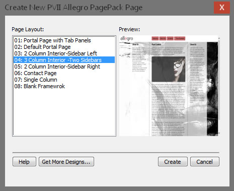
Click Create and save the new page as after.htm
Once the page is created, all we do is edit the menu, using the included DMM interface, to set up the same links as our before page has.
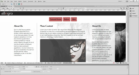
That's it. Make no other changes at this point.
Step 2: Save the after.htm page as a template
We already have a template file called Before.dwt, which is the parent template for our hypothetical existing web site. We do not yet want to overwrite that template. We need to test our new template first.
Choose File > Save as Template
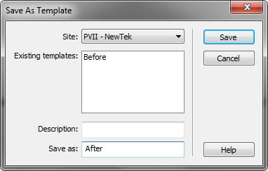
In the Save as box, type in After.
Now we have two template files:

Step 3: Match up Editable Regions
In order to have the existing editable content, from the before page, be placed in the proper area of the after page, we need to create the same editable regions in the After.dwt file.
Our Before template contains 3 editable regions inside the body:
- LeftSidebar
- MainContent
- RightSidebar
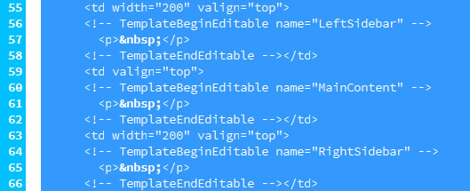
In your After.dwt file, select all of the content in the left sidebar, then choose Insert > Template > Editable Region
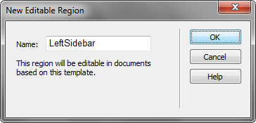
For the Name, enter LeftSidebar
Repeat for the middle column and the right sidebar, making sure the names for those editable regions are MainContent and RightSidebar.
Save the After.dwt file.
Step 4: Apply the After Template to the before.htm page
Open before.htm
Choose Modify > Templates > Apply Template to Page...
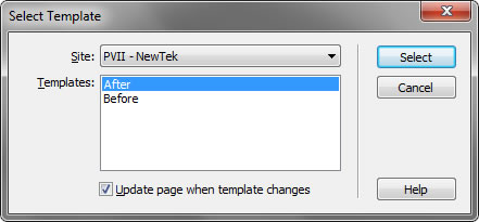
Select the After template and click Select.
That's it. You have now successfully completed the testing phase. Your before.htm page is now responsive, looks gorgeous, and all of the content is in the right place. If it isn't, you probably messed up a step, so review your work or post a topic on our web forum and we'll be happy to help you out.
Step 5: Overwrite the Before template
The last step is simple. You're going to overwrite the Before template with the After template.
Open After.dwt
Choose File > Save As
Browse to your Templates folder and select Before.dwt
Accept the overwrite prompt.
Now, all pages in your site that are linked to the Before.dwt template will be converted to the Allegro-based design.
Afterthoughts
This is an amazing way to convert older sites. But remember that you will most likely need to do a little cleaning up to remove elements you have added over the years that are not mobile-friendly. Here are some things to look for:
Flash objects should be removed or replaced.
Any element with a fixed width needs to be made adaptive (percentage width or no width)
Videos and forms need to be made adaptive.
Tables need to be made adaptive and mobile friendly. For this, we have an indispensable tool that will automate the process. See Mobile-Friendly Table Converter for more information.
