Buy Now ($60) | View Example Pages | View PDF User Guide
Responseability...
Mobile-Ready Layouts powered by Tab Panel Magic 3
Build mobile-ready and responsive single-page sites in Dreamweaver—instantly. Add as many pages as you need and configure the content layout of each page in single or multi-column formats.
Note: Requires Tab Panel Magic
It couldn't be any easier...
Making a single-page site could not possibly be any easier. Open the responseability interface, select a layout, choose whether to include an extra multi-column footer, create your tabs, configure each tabbed page layout with up to 4 columns and then click OK. Your single-page site will be created instantly.
The Interface
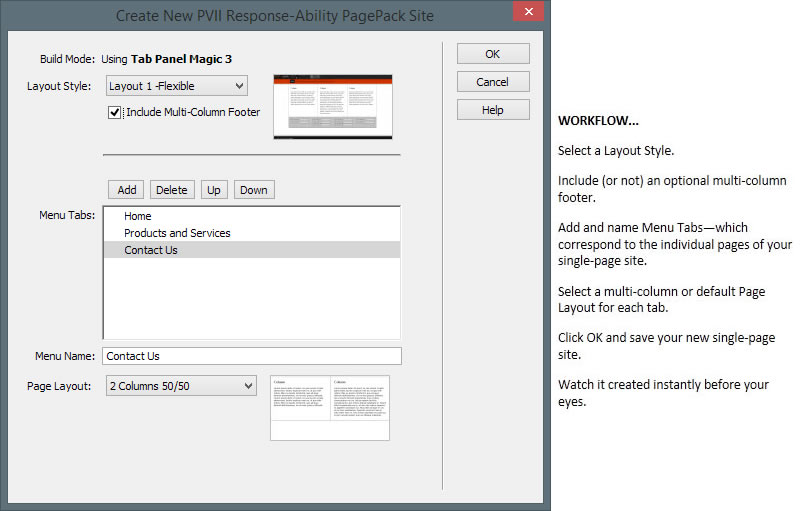
Site Management
Once you create your site using the responseability interface, you can manage it using the Tab Panel 2 interface—from which you can add, remove or reorder tabs; or change animation options (horizontal, vertical, fade, or none). All of the powerful features of Tab Panel Magic are available, including the ability to create new content areas configured in 1-4 column layouts.
Tutorial: Convert Existing Page to use TPM3
In this tutorial we will show how to convert an existing Response-Ability page to use Tab Panel Magic 3.
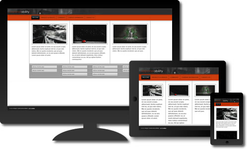
Mobile-Ready and Responsive
Your responseability layout will respond to the width of your browser window to ensure that your page always displays in a usable and readable way—in all browsers and on all devices. This is done seamlessly, with CSS, so that one page design fits all devices and all screen sizes.
Pages automatically adjust for optimal display on smartphones, tablets, and desktop computers. Whether you are a CSS novice or a seasoned pro, responseability is a valuable addition to your developer toolkit—instantly providing you with a means to deliver stable responsive designs to your customers and visitors.
Responseability works on Windows and Mac systems running Dreamweaver MX, MX2004, 8, CS3, CS4, CS5, CS5.5, CS6, CC, CC 2014, CC 2015, CC 2016, CC 2017, CC 2018, CC 2019, CC 2020, CC 2021 (and higher). For installation tips, please see Using PVII Extensions in Dreamweaver CC...
Key Features
- Automatic Page-Creation interface
- Powered by Tab Panel Magic (required)
- Equal height columns without background images
- Pages automatically adjust for smartphones, tablets, and desktop browser widths
- Search-engine friendly
- Mobile-Ready and Responsive
- Standards-based and accessible
- Stable cross-browser compatibility
- PDF user guide
- Free technical support
Progressive enhancement
Responseability employs the concept of progressive enhancement. We start with well-formed code that displays all content in all devices. Then we use CSS 3 for rounded corners, shadows, and to reflow and optimize the layout based on browser width and device type. These effects are deployed in ways that enhance modern browsers and devices while assuring an attractive and accessible presentation in older browers.