PVII CSS Q.Tabs
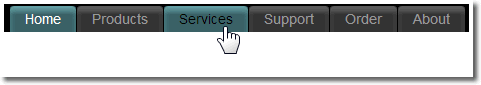
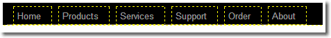
Have you ever wanted to make simple and accessible navigation bars that were pure text but displayed as scalable graphical tabs with hover effects that behaved like image rollovers? We did too. So we wrote this tutorial. Before you begin, take a look at the finished Q.Tabs:
How the tabs work
Q.Tabs work on list-based menus by leveraging the CSS background-image property and box-model on both the link (<a>) and its parent list item (<li>). In a list menu, the link is a child of the list item because it's inside of the list tag:
<li><a>Here is a link</a></li>
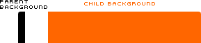
When a background image is assigned to both a parent and a child, the child element's background sits on top of the parent element's background - obscuring it. If, however, you assign padding to the parent element, the child element is offset and the parent's background image can be seen inside the offset.
Here are facsimiles of the types of background images used to construct tabs:
We've intentionally colored one black and the other orange for illustrative purposes. The skinny black one is the left edge of the tab. It is 10 pixels wide. Notice how its top left edge is gently curved while its right edge is straight. The wider orange one forms the right side of the tab. Its top right corner is curved and its left edge is straight.
The orange background image is assigned to link element (the <a> tag), which is a child of the list element (the <li> tag). Assigning a 10px left padding on the parent element creates a gap where the background image assigned to the parent element (the left edge of the tab) can show through:

In a natural setting, both edges of the tab would be the same color and the two background images are joined at their straight edges to form a perfect tab:

The greater width on the right background image allows the tab to scale larger to accommodate longer link text or larger sized text:

We'll use CSS to change both background images on hover. The CSS we'll use is supported by modern browsers, including MSIE 7, but is not supported by IE6 and under. But do not fear, we will be using a small JavaScript to make those older browsers work just like the new ones.
The Tab Background Images
We created our tab images in Adobe Fireworks.
Download the Fireworks PNG we used for this tutorial
Note: If you don't have Fireworks, you can download a trial version or you can open the flattened PNG in Photoshop and recreate the slices.
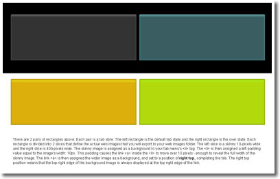
There are 2 pairs of rectangles above. Each pair is a tab style. The left rectangle is the default tab state and the right rectangle is the over state. Each rectangle is divided into 2 slices that define the actual web images that you will export to your web images folder. The left slice is a skinny 10-pixels wide and the right slice is 400-pixels wide. The skinny image is assigned as a background to your tab menu's <li> tag. The <li> is then assigned a left padding value equal to the image's width: 10px. This padding causes the link <a> inside the <li> to move over 10 pixels - enough to reveal the full width of the skinny image. The link <a> is then assigned the wider image as a background, and set to a position of right top, completing the tab. The right top position means that the top right edge of the background image is always displayed at the top right edge of the link.
The 4 slices in this Fireworks file are:
- type1_left
- type1_right
- type2_left
- type2_right
They are optimized as JPGs. When you export these slices to your Dreamweaver web images folder, they become:
- type1_left.jpg
- type1_right.jpg
- type2_left.jpg
- type2_right.jpg
If you are not sure how to export slices from Fireworks, please see the Fireworks help topic: Exporting Slices.
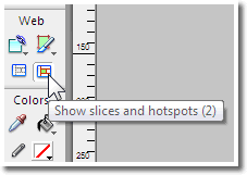
If you are using a current version of Fireworks, you can export each slice separately. To do this: Turn on the Web Layer by clicking the Show slices and hotspots icon on your Fireworks toolbar.
Right-click the slice. The first choice on the popup context menu will be Export Selected Slice.
Building the menu
The menu is actually an unordered (bullet) list. We use CSS to display the list items horizontally and to hide the bullets.
Making the base menu list
- In Dreamweaver, create a new page in your defined site and save it.
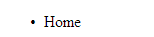
- In Design View, type the word Home
- With your cursor on the line click the Unordered List icon on your Property Inspector.
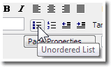
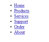
You'll see the word indent and a bullet will appear to its left:
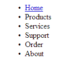
Press Enter at the end of the line to create a second list item and type the word Products. Repeat the process to add the words Services, Support, Order, and About. Your page should look like this:
Select the word Home and set a temporary null hyperlink by typing a hash into the link box on your Property Inspector.
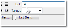
Do the same for each of the remaining items.
Adding a wrapper DIV
The menu needs a container. Why it needs one will become clear as you complete the tutorial. This task needs to be performed in code view. Here is how your menu looks:
<ul>
<li><a href="#">Home</a></li>
<li><a href="#">Products</a></li>
<li><a href="#">Services</a></li>
<li><a href="#">Support</a></li>
<li><a href="#">Order</a></li>
<li><a href="#">About</a></li>
</ul>
Create a new line above the opening <ul> tag and create an opening <div> tag. Assign the tag an ID of p7menubar:
<div id="p7menubar">
Create an ending </div> tag on a new line below the ending </ul> tag. The entire code block now looks like this:

Save your work. Now let's create some CSS.
Creating the menu CSS
Creating and editing CSS are fundamental Dreamweaver tasks. Create a new CSS document in the same folder that contains your work page. You can do this using Dreamweaver's File > New command. Save the CSS file as qtabs.css and proceed to the next task:
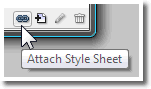
Open your CSS Styles panel (shift + F11). At the bottom of the panel you'll find 4 icons. Click the Attach Style Sheet icon.
The following window will open:
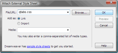
Note: Older versions of Dreamweaver might display a slightly different window.
- Type qtabs.css in the File/URL box.
- Choose Link as your Add as option
- Leave the media field (if present in your version) blank
- Click OK.
Locate qtabs.css in your Files panel and open it.
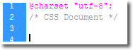
Note: Depending on your Dreamweaver version, you will see a @charset attribute and/or a comment that says /*CSS Document*/. We know this is a CSS document and the character set is really not necessary (but is harmless) so you can leave them there or remove them at your discretion.
On the first blank line, enter the following CSS rules:
body {
font-family: Arial, Helvetica, sans-serif;
color: #000000;
background-color: #FFFFFF;
margin: 0px;
padding: 0px;
min-width: 750px;
}
Every page should have a body rule. We set a global font-family, color, and background color. We zero out margin and padding and set a min-width. You can safely edit any of the body properties to suit.
#p7menubar {
font-size: 0.85em;
background-color: #000000;
float: left;
width: 100%;
}
This is the containing element for the menu. We set a font size and background color (black). We set width to 100% and we float it left. Floating this box left allows the container to stretch the full height of the likewise floated menu items. If you remove the float property from this rule you will need to use a clearing element before the #p7menubar DIV's ending tag.
#p7menubar ul {
margin:0;
padding:10px 10px 0 10px;
list-style-type:none;
}
The menu UL is given a zero margin and 10 pixels of padding on the top, right, and left sides. Setting list-style-type to none eliminates bullets.
#p7menubar li {
float:left;
margin:0 1px 0 0;
padding:0 0 0 10px;
background-image: url(images/type1_left.jpg);
background-repeat: no-repeat;
}
The menu list items are floated left, which causes them to display horizontally. The right margin is set to 1px so that each menu item (soon to become a tab) has a bit of separation from its neighbors. Left padding is set to 10px, providing space for the 10-pixel-wide background image to display without being covered up by the background image we will be assigning the the link inside the list. The background image is set to not repeat (tile). By the way, the actual image will be along later in the tutorial once you export it from the Fireworks PNG you downloaded.
#p7menubar a {
float:left;
display:block;
padding:5px 15px 5px 5px;
text-decoration:none;
color:#999999;
background-image: url(images/type1_right.jpg);
background-repeat: no-repeat;
background-position: right top;
}
The menu links are set to float left to enable us to set them to display block, which allows the entire width and height of the link box to be hot or clickable. Padding is set to 5px top, 15px right, 5px bottom, and 5px left.
Hmm... 15px on the right and only 5px on the left will make the link off-center, won't it? Yes it will. But we need to compensate for the 10px of left padding on the parent LI that is needed to allow the parent element's background image to show.
We set text decoration to none (turns off underlining) and color to medium gray (#999999).
We set a background image (the wide right side of the tab), set it to not repeat, and position it at the top right edge of the link box.
#p7menubar a:hover {
color:#000000;
}
We set the hovered link color to black.
#p7menubar li:hover, #p7menubar li.p7hvr {
color:#333;
background-image: url(images/type1_left_on.jpg);
}
This rule is one of two rules that make the Q.Tab menu possible. It's a grouped selector, combining two selector names in one, separated by a comma. The first selector leverages modern browsers' ability to execute a hover behavior on elements other than links. In this case, we are assigning a hover behavior to the LI to change its background image from type1_left.jpg to type1_left_on.jpg. The second selector name #p7menubar li.p7hvr references a class name (p7hvr) that is used in a small JavaScript to allow IE6 (and under) to perform the LI hover just like modern browsers do.
#p7menubar li:hover a, #p7menubar li.p7hvr a {
background-position:right top;
background-image: url(images/type1_right_on.jpg);
color: #000000;
}
This is the second key rule that makes Q.Tabs possible. Like the previous rule, It is a grouped selector — but it's a grouped descendant selector, targeting the link <a> tags inside the list item <li> tags. This rule changes the background image on the link <a> elements from type1_right.jpg to type1_right_on.jpg, completing the total swap from the default tab state to the over tab state.
We also set the hovered link color to black.
Note: Why did we use this descendant selector to swap the link background instead of using the plain old #p7menubar a:hover class? If someone is using an older version of IE, and has script disabled, the a:hover class would work and the link background would change. But the li:hover would not work and you'd be left with half a tab. In this scenario, half a tab is not better than none.
Save the CSS file.
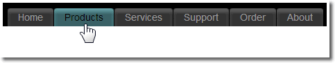
Your menu should now look like this:
If you preview the page in a browser, the links will hover to nothing because we still need you to open up Fireworks, load up the PNG you downloaded, and export the images to your site.
Exporting the tab images from Fireworks
If you haven't already done so, unzip the Fireworks PNG you downloaded and open it in Fireworks.
Note: If you are a seasoned Fireworks user or if you like living dangerously, you can edit the image, but please do it after you have completed the following tasks and do create a backup copy of the original PNG first.
In your Dreamweaver site, create a new folder named images inside the folder that contains your working page. Switch back to Fireworks.
To export the tab images to your web site, choose File > Export
Browse to the images folder you created in your Dreamweaver site so that images appears in the Save in box at the top of the window.
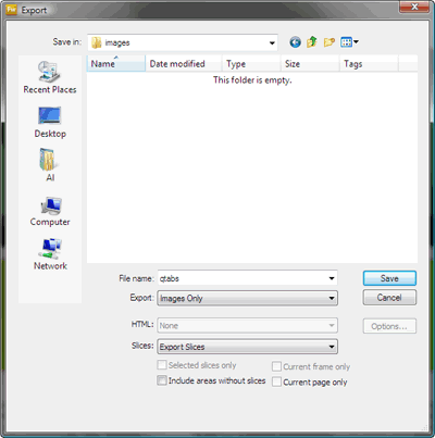
The File name is irrelevant because you will be exporting slices.
- In the Export list, choose Images Only (HTML will become grayed out)
- In the Slices list, choose Export Slices
- Leave all checkboxes at the bottom unchecked
- Click Save
Switch back to Dreamweaver.
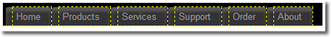
If you have an older version of Dreamweaver or if you are using a Mac version, save, close, and then re-open your work page. Your Tabs should be there waiting for you:
Now we'll need to set up the little script workaround for IE6 and under.
Linking the PVII CSS Express Script
The script file has been zipped up for your convenience.
Unzip the script and place it inside the same folder that contains your working page.
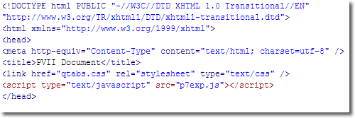
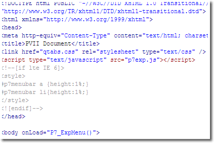
In your page, switch to Code View and locate the ending head tag </head>. Make a new line above the ending </head> tag and paste in this code to link your page to the script:
<script type="text/javascript" src="p7exp.js"></script>
Your page code head section should look like this:
Note: Depending on your Dreamweaver version, you might have a different DOCTYPE at the top of the code. So long as the DOCTYPE is complete it does not matter if it's HTML or XHTML.
Initializing the script
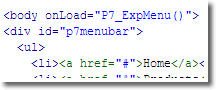
In order to run, the script must be initialized. Locate the opening body tag <body> and add the initializer:
<body onload="P7_ExpMenu()">
Note: If using an XHTML DOCTYPE, the word "onload" must be in all lowercase letters. Also note that JavaScript is case sensitive, so make sure the "P", the "E", and the "M" are capitalized.
Your body tag should look like this:
Additional IE workarounds
IE6 and under need a few additional CSS fixes. We'll deploy them in a Conditional Comment so they will be read only by IE6 and under. Other browsers will not read the styles.
Copy the code block below and paste it on a new line, just above your page's ending </head> tag.
<!--[if lte IE 6]>
<style>
#p7menubar a {height:1%;}
#p7menubar li{height:1%;}
</style>
<![endif]-->
Your code should look like this now:
Preview the page and your tabs should work perfectly.
Current Page Link Class
If you'd like a special current page link class to be assigned to the link that matches your current page, add these style rules to the bottom of your qtabs.css file:
#p7menubar .current {
background-image: url(images/type1_left_on.jpg) !important;
color: #FFFFFF !important;
}
#p7menubar .current a {
background-image: url(images/type1_right_on.jpg) !important;
color: #FFFFFF !important;
cursor: default;
}
To deploy the current page link, assign the current class to the relevant list item. For example, in the menu you just built, if you want to set the Home link to be the current page link, assign the current class to the <li> tag that contains the Home link. The code would look like this:
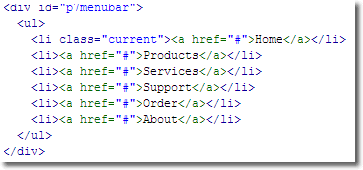
The Home link will be highlighted:
That's a wrap, folks. We do hope you find this technique useful.
The PVII Team