Omni Panels User Guide
Installing Omni Panels
Extension installer files come in 2 formats: MXP and ZXP.
MXPs are supported by Extension Manager versions MX, MX2004, 8, CS3, CS4, CS5, CS5.5 and CS6.
ZXP is supported by versions CS5.5 and higher.
To install this product,
- Open your Extension Manager
- Click the Install icon or link
- Browse to where you unzipped the installer file
Dreamweaver CC 2015 (and higher) Extension Installation Information
As of CC 2015, Adobe has ceased to support its own Extension Manager. Use the PVII Extension Manager for Adobe Creative Cloud:
PVII Extension Manager for Adobe CC
( Windows and Mac)
Download and Install Instructions
Accessing Omni Panels
There are 3 ways to access Omni Panels. Choose the one most suitable to your workflow. When you open an interface, the system will detect the appropriate mode (Insert or Modify).
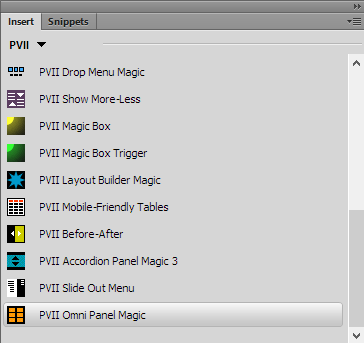
1. Insert Bar
Switch to the PVII category. Omni Panels is the last one (orange) in the screen capture below
2. Insert Panel
Switch to the PVII category. Omni Panels is the last one (orange) in the screen capture below
3. Insert Menu
Choose Insert > Studio VII > Omni Panel Magic by PVII
Omni Panels Interface: Options & Settings
The Omni Panels interface provides an easy to customize your widget
The OPM Interface
Adding and Managing Panels
The OPM UI allows you to easily Add Panels, Delete Panels, or Move them Up or Down.
User Class
For each panel you add, you can assign an optional User Class for the Trigger (Tab), the Panel, or both. Enter the name of the class without the leading period (dot). You can also add multiple classes to either element. To do so, enter each class name separated by a space. To add the classes rounded and text-centered, for instance, you would type:
rounded text-centered
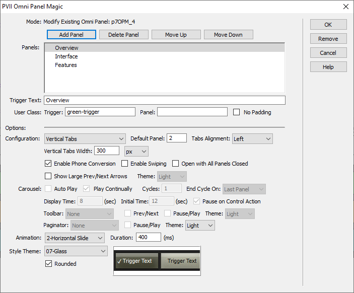
Configuration
The following configurations are available:
Text with Vert Conversion (default mode)
In this mode, when viewed in a browser, the system will endeavor to display your tabs in a single horizontal row. If there is not sufficient space to do this, your tabs will automatically convert to a vertical column, displayed to the left of your content panel.
Normal Tabs
Your tabs will display horizontally, wrapping to multiple lines if needed.
Vertical Tabs
Your tabs will display in a vertical column, displayed to the left of your content panel.
Carousel
Your tabs will be hidden. Only the content panel will be shown. In this mode you can choose from several types of navigation aids (if you want), such as Previous/Next Arrows, a Toolbar, or a Paginator.
Panel and Tabs Settings
Once you set a configuration, you can choose a Default Panel—the panel active (visible) when the page first loads—and your Tabs Alignment (left, right, or center), plus these additional options:
Vertical Tabs Width
Set the width for your tabs when in vertical display mode. Choose either a fixed pixel or a percentage value.
Enable Phone Conversion (default)
When this option is selected, which it is by default, the system will detect when the browser or device viewport is less than 700 pixels wide. When it is, your Omni Panels widget will automatically convert to an accordion presentation. This mode is the most efficient and usable way to view your panels on a phone. If you disable this option, your widget will display horizontal or vertical tabs, depending on your configuration setting. If your page is responsive, we highly recommend that leave this option enabled.
Enable Swiping
This option, which is disabled by default, will enable swiping support on touch devices. Because of the various navigation options available to Omni Panels, swiping is not necessarily a good choice as it could impede normal up and down swiping of the underlying page.
Open with All Panels Closed
This option, which is disabled by default, will start with all of the panels in the closed state when the page first loads on smaller devices.
Show Large Prev/Next Arrows
This option is available for all configuration modes and selecting it will cause large previous and next arrows to display, vertically centered, at each end your content panels.
Theme
The Theme option allows you to select light or dark arrows.
Carousel Options
The following options are available only when the carousel configuration mode has been selected.
Carousel Play Options
- Auto Play
Start playing when the page loads - Play Continually
- Cycles
Choose the number of cycles to play - End Cycle On
End playing on the last panel or the first one
Carousel Timing and Control
- Display Time
Set how long each panel will display before advancing to the next panel - Initial Time
Set a delay, when the page first loads, before the panels begin to cycle - Pause on Control Action
Cease cycling while the user's mouse is over the Omni Panel widget
Carousel Toolbar
Choose whether to display a toolbar or not, and whether to display it above or below your panels.
Configure your toolbar to display either or both of the following controls:
- Prev/Next
- Pause/Play
You can also set a light or dark theme for your toolbar
Carousel Paginator
The Paginator is an web-standard UI element comprised of circles, each circle indicating a page or, in this case, a panel. The circles can be clicked or tapped. When in auto-play mode they also serve as an indicator of which panel is current and how many additional panels come before and after.
Animation
Panels can be animated or not. The following animation methods are available:
- None
- Fade
- Horizontal Slide
- Vertical Slide
- Zoom
- Fold
Duration
Set the time, in milliseconds, that the animation will span, from beginning to end. The default value of 400 is usually a good choice. Increase the number to slow the animation. Decrease the number to speed the animation up.
Style Theme
Select from the following themes for your Omni Panel widget:
- Tabbed
- Buttoned Down
- Free Tabs Dark
- Free Tabs Light
- Naked Dark
- Naked Light
- Glass
A preview of the theme will appear, based on your selection:
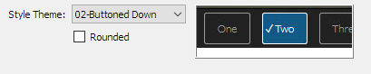
Rounded
Select the rounded option and the appropriate areas of your Omni Panel widget will be displayed with rounded corners.
URL Parameters
You can set up an external link to a page that contains an Omni Panels widget, and have that link open the page and open a specific OPM panel. The URL syntax to use is:
Domain + page + ?opm=1_3 | Try it...
You can also open a page and open multiple panels, using this syntax:
Domain + page + ?opm=1_3&opm=2_2 | Try it...
CSS Editing
Omni Panels uses 2 linked style sheets:
1. A Core style sheet (p7OPM-Core.css)
2. A Theme style sheet (p7OPM-01.css - p7OPM-07.css)
The Core CSS file should never be edited. The theme style sheet (p7OPM-01.css - p7OPM-07.css) is where you would edit colors.
Customizing Colors
When editing CSS, you should avoid using Dreamweaver's CSS panel or CSS Designer, as your CSS can easily become corrupted. Open your theme CSS file in Code View.
When in Code View, you will see that we have added comments, as depicted below. The CSS files are extremely straightforward and colors are quite easy to customize. If it is not apparent to you, then your CSS skill levels are at the beginner level and you should request support. We'll be happy to help you learn!
/*
-----------------------------------
Omni Panel Magic
by Project Seven Development
www.projectseven.com
Style Theme: 01 - Tabbed
-----------------------------------
*/
.p7OPM-01.p7OPM {
padding: 0px;
border: 1px solid #000;
}
/*
**********************************
PRIMARY COLOR RULES
**********************************
*/
.p7OPM-01 .opm-tabs-wrapper {
background-color: #222;
}
.p7OPM-01 .opm-panel-wrapper {
background-color: #FFFFFF;
color: #000000;
}
.p7OPM-01 .opm-tabs-wrapper a {
padding: 12px 20px;
}
.p7OPM-01 .opm-tabs-wrapper a,
.p7OPM-01 .opm-accordion-trig a {
background-color: #222;
color: #999;
}
.p7OPM-01 .opm-tabs-wrapper a:hover,
.p7OPM-01 .opm-accordion-trig a:hover {
color: #DDD;
}
.p7OPM-01 .opm-tabs-wrapper a.open,
.p7OPM-01 .opm-accordion-trig a.open {
color: #000;
background-color: #FFF;
position: relative;
}
/*
**********************************************
Current Tab Marker (character entity)
**********************************************
*/
.p7OPM-01 .opm-tabs-wrapper a.open:before {
content: "\2713";
}
Note: The content value is what determines the character used for a particular theme to mark the current panel. You can change this if you'd like. Use the following site to view codes: special-characters
There will be 2 codes listed below the character. Use the one on the right side and always precede it with a backslash. Style themes 5 and 6 use a more complex CSS method to display an animated ellipsis. It is recommended that you do not edit this unless your CSS skill level is advanced.
If you would like to learn more about these techniques, please request support.
/*
******************************************************
Colors for Accordion Mode (Phone View)
-By default, colors for all modes are the
same. Use the rules below if you would like
to have different colors for accordion mode.
******************************************************
EXCEPTION COLORS FOR ACCORDION (PHONE) MODE
*/
.p7OPM-01 .opm-accordion-trig a {}
.p7OPM-01 .opm-accordion-trig a:hover {}
.p7OPM-01 .opm-accordion-trig a.open {
background-color: #AAA;
}
.p7OPM-01 .opm-accordion-trig a.open {
font-weight: bold;
}
.p7OPM-01 .opm-accordion-trig {
border: none;
border-bottom: 1px solid rgba(0,0,0,0.95);
}
.p7OPM-01 .opm-accordion-trig a {
padding: 12px;
text-decoration: none;
}
/*
*********************************
Panel Content Rules
*********************************
*/
.p7OPM-01 .opm-panel-content {
padding: 20px 36px;
}
/*
********************************
Content Utility Rules
********************************
*/
.opm-panel-content img.scalable-rounded {
border-radius: 5px;
}
The blurb classes use advanced CSS animations. We recommend that you do not edit these rules. You can assign the blurb animation any element inside your panel. We recommend restricting application to headings and small images. To assign, simply select the element and assign the blurb class to it.
.p7OPM-01 .blurb {
-webkit-transition: all ease 1.25s 0s;
transition: all ease 1.25s 0s;
-webkit-transform: translateX(90%);
transform: translateX(90%);
opacity: 0;
letter-spacing: .2em;
}
.p7OPM-01 .current-panel .blurb {
-webkit-transform: translateX(0);
transform: translateX(0);
opacity: 1;
}
Support Options
Before making a support inquiry, please be certain to have read the documentation that came with your product. Please include your Order Number, Dreamweaver version, as well as your computer operating system type in all support correspondence.
Support Forum
PVII maintains a Web Forum community. Go Direct to the Web Forum
E-Mail and Phone Support
E-Mail: support@projectseven.com
Phone: (336) 374-4611
Phone hours are 9:00am - 5:00pm Eastern Time U.S.