Also see Part 2, which will teach you how to use CSS multiple backgrounds to create simple color overlays over standard background images as well as fixed (non-scrolling) background images.
This tutorial is based on Harmony version 1.1.6 or later. If your version is older, please re-download now.
You can set simple or complex background images to any Harmony element, by assigning User Classes to Harmony Sections, Columns, or the entire Harmony Grid. User classes are one of the most powerful features in Harmony, allowing you full freedom to customize individual elements beyond the options in the UI. User classes are assigned directly in the Harmony interface and point to CSS classes that you create, giving you total design freedom. If you are a proficient CSS author, the User Class entry boxes in the Harmony UI allow entry of multiple class names. Simply separate each class name with a space. Just remember that user class names must never contain the word harmony or the acronym hmy.
Note: User Class rules are best kept in a separate CSS file so they can be more efficiently managed. We suggest creating a new CSS file and naming the file p7HMY-user.css and placing it inside your p7hmy folder. Link the file in your document head so that it comes after the default Harmony CSS file link:
<link href="../p7hmy/p7HMY-01.css" rel="stylesheet" type="text/css" media="all">

            <link href="../p7hmy/p7HMY-user.css" rel="stylesheet" type="text/css" media="all">
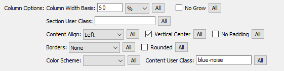
Nothing could be easier! Simply assign a Content User Class (blue-noise) to your Harmony column in the Harmony UI.
.blue-noise {

          background-image: url(images/blue-noise.jpg);

          background-color: rgb(75,103,119);

          }
Note: A background-color is assigned, in a complimentary shade of blue, to act as a placeholder for the image in the event of a slow connection, or if the end-user has disabled background images in his or her browser.
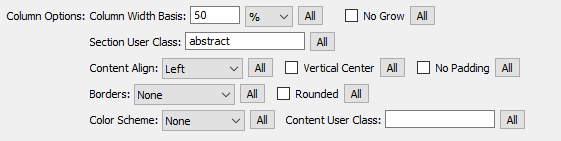
The background image assigned to this column is an abstract image, which fades gradually out at its bottom. We assigned a Section User Class of abstract to drive our CSS rules. We use the Section User Class because this type of image will require an overlaid color so that the content remains readable.
.abstract {

          background-image: url(images/abstract.jpg);

          background-repeat: no-repeat;

          }
The background image is assigned to the hmy-section DIV. We use a descendant selector to target the content-wrapper inside, assigning it a semi-transparent background-color, which allows the background image to peek through. We also assign a dashed border to separate the two columns.
.abstract .hmy-content-wrapper {

background-color: rgba(199,82,85,0.5);

border-left: 1px dashed #000;

}
On small screens, our Harmony columns are linearized, so a border would look silly. We'll add media query to turn the border off:
@media only screen and (min-width: 0px) and (max-width: 600px) {

          .abstract .hmy-content-wrapper {border-left: none;}

          }
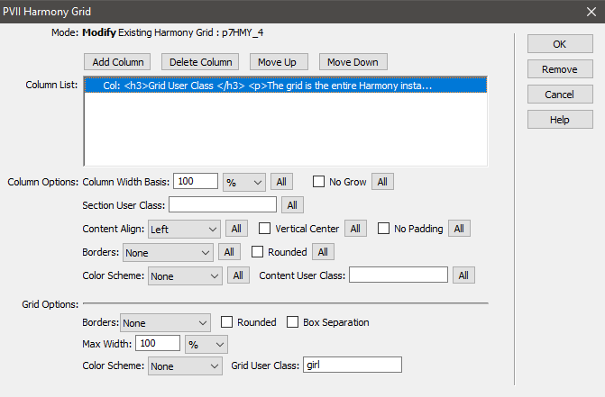
For a more complex, and interesting background image treatment, let's set a fixed position background and drive it all off a Grid User Class. The grid is the entire Harmony instance—its root DIV. Here we assign the user class girl, which assigns a fixed attachment background image. We'll also add two descendant selectors. The first is assigned to the hmy-section DIV, adding a semi-transparent background color, which allows the background image to peek through. The second is assigned to the hmy-content DIV, setting a max-width for the content... a nice effect for this particular single column Harmony row. We'll also need to set up a media query to deal with iPhones and iPads, which do not support fixed background images or background-size: cover.
.girl {

background-image: url(images/girl.jpg);

background-attachment: fixed;

background-size: cover;

}
.girl .hmy-section {

background-color: rgba(0,0,0,0.75); /*Allows BG to Peek Through*/

}
.girl .hmy-content {

          max-width: 1000px; /*Sets Maximum content width*/

          margin: auto; /*Centers content DIV*/

        }
Because there are so many different types of iPhones in the wild, it would take at least a half dozen media queries to cover each on. To simplify things, we are simply going to turn off fixed background and background size for all devices when the screen width reaches 600 pixels.
@media only screen and (min-width: 0px) and (max-width: 600px) {

          .abstract .hmy-content-wrapper {border-left: 1px dashed #000;}

          .girl {background-attachment: scroll; background-size: auto;}

          }
The following media query will target all current iPads:
@media only screen and (min-device-width : 768px) and (max-device-width : 1024px)  {

.girl {background-attachment: scroll; background-size: auto;}

}