Tutorial: The amazing Accordion Splash page make your mark with an APM3 Marketing Presentation
Before you begin the tutorial, do have a look at the finished page...
1. Download the Work Folder
Before you begin, download the work folder we've prepared for you.
Unzip the apm3-Splash-Tutorial folder inside your defined Dreamweaver local site. Inside you will find the following folders and files:
- images
- art-1.jpg
- art-2.jpg
- art-3.jpg
- flattened.jpg
- apm-splash.css
- test-link.htm
- work-page.htm
Open work-page.htm in Dreamweaver.
All of the necessary assets are already linked to the work page, which is ready and waiting for you to create your splash accordion.
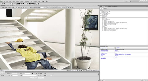
Create your Splash Accordion
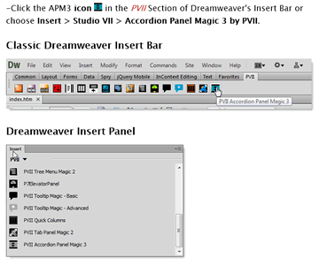
Click in the page to ensure an active insertion point and open the APM3 interface from Dreamweaver's Insert Panel, Insert Bar, or Insert Menu.
The APM3 interface will open.
Click the Add Panel button and add as many panels as you want. As you add each panel you can use the Content Layout option to set the number of columns to display in the panel.
Since you are making a marketing splash page, label your last panel heading Back to Our Site... (or similar) and set that panel heading to Link Only - No Associated Content Panel and Set the Link Path to test-link.htm
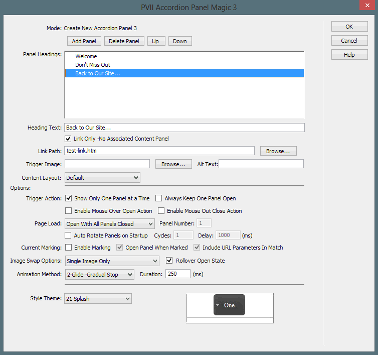
Set Style Theme to 21-Splash
Click OK
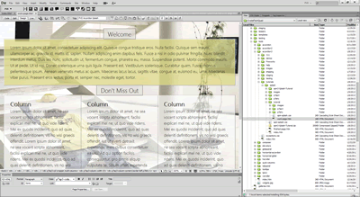
Preview in a browser...
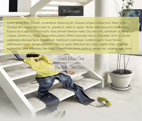
That's it! Good job.
CSS Notes
For the most part, the accordion you built is default—based on the Splash style theme. There are a few key (but simple) customizations made. Most of them involve the page layout. Let's explore them. The work page uses a layout style sheet called apm-splash.css, which is linked to the page. Here are the rules:
html, body { height: 100%; width: 100%; }
The body and html elements are set to 100% height and width to accomodate a page-covering background image.
    body {

    font-family: Optima, "Segoe UI Light", Arial, sans-serif;

    background-image: url(images/flattened.jpg);

    background-repeat: no-repeat;

    background-size: cover;

    background-color: #DEDBD4;

    overflow-y: scroll;

    margin: 40px 0px;

    }
We set a font-family for the page. Optima and Segoe are excellent typefaces for the Mac and Windows operating systems respectively. A background image is set and we use the background-size property to instruct modern browsers to scale the image so that it covers the entire window. Since we are using an accordion, we set overflow-y to scroll. This ensures that modern browsers always reserve space for a vetical scroll bar, which prevents the page from jumping if the content of a panel is sufficient to warrant a scroll bar. We set top and bottom margins to 40px to provide a bit of buffer space at the top and bottom of the page.
    img.scaled {

    height: auto !important;

    width: auto !important;


    max-width: 100%;

    border-radius: 8px;

    display: block;

margin: 0px auto;

    opacity: .75;

    -webkit-transition: opacity linear .5s .1s;

    transition: opacity linear .5s .1s;

    }
The scaled class is available to assign to images that you want to make scalable. Regardless of their natural size, images assigned this class will never exceed the width of their container. We als assign a border-radius to round the corners of the image and set display block and auto left/right margins to ensure that if they are narrower then their container, they will automatically center. Opacity is set to .75, which makes the images 25% transparent. We then stage a CSS3 fade animation using the transition property (Chrome and Safari still require the webkit prefix, hence the duplicate listing). The transition is staged to use the opacity property and animate it linearly (non-stop from beginning to ending values) for a duration of .5 seconds after a delay of .1 seconds. We say the transition is staged because the trigger for the animation is the hover state, which is our next rule...
img.scaled:hover {opacity: 1;}
This rule triggers the CSS3 fade effect when you hover over an image. Modern browsers see that you have declared a transition in the default scaled class for the opacity property. It then compares the value for opacity in the default rule to the value in the hover rule and animates the transition from the original value to the hover value.
Note: If you would like to experiment with images, we included the 3 images from our finished page in images folder that comes in the apm3-Splash-Tutorial folder you downloaded. The images are called art-1, art-2, and art-3. They are JPG format files. Simply insert them into the 3 columns inside the second panel of your APM3 widget and assign each image the scaled class.
.p7AP3-21 {padding: 0px 20px;}
This is an exception rule for the page that sets left and right padding on the entire accordion to provide a bit of white space on the edges when the browser window is narrow.
.p7AP3trig.p7ap3-theme-21 {font-family: "Life Savers", Optima, "Segoe UI Light", Arial, sans-serif;}
This rule declares a special font-family for the accordion panel headings. Life Savers is a Google web font. It is served by the following CSS link in the head of the work page:
<link href="http://fonts.googleapis.com/css?family=Life+Savers" rel="stylesheet" type="text/css">
If you would like to try a different font, go to Google Fonts online and choose another. After making a choice change the value in the CSS link and the CSS font-family to match.
.p7AP3trig.p7ap3-theme-21 h3, .p7AP3trig.p7ap3-theme-21 h4 {font-size: 2em;}
We reset the accordion panel headings to a larger font-size. If you prefer a different size, simply change the value to suit.
.p7AP3panelcontent.p7ap3-theme-21 {font-size: 1.35em; border-color: #FFF;}
We reset the font-size and the border color for the accordion content panels.
.p7AP3cwrapper.p7ap3-theme-21 { max-width: 1440px; margin: 0px auto; }
we set a max-width on the accordion content wrapper and center it with left and right auto margins. Remove the max-width if you would like your accordion content to scale full-width or change the value to suit.
#p7AP3p1_1 { background-color: rgba(222,218,133,0.75); }
When you create an APM3 widget, each content panel is assigned an ID. This allows you to target specific panels for custom attributes such as background-color, which is exactly what we are doing here. The ID p7AP3p1_1 represents the first panel. We assign it a custom wheat-hued background color using RGBA, which allows us to also set a transparency level. The first 4 numbers represent the red, green and blue values. The last number represents the opacity level (75% opaque).
Media Query for Smartphones
APM3 widgets are responsive by default. If you opt for multiple columns, for example, in your panels, those columns will reflow into a single column on smartphones. Some of the customizations we made for our splash page will look better on phones if we temper or reverse them. So we add a simple media query to the bottom of the style sheet and define the changes we want for phone presentation.
/*1 Column for Narrow Browser Windows and Smartphones in both orientations*/

    @media only screen and (min-width: 0px) and (max-width: 700px) {

    body {margin: 20px 0px;}
We reduce the top and bottom margin on the body.
.p7AP3-21 {padding: 0px 0px;}
We eliminate padding on the root APM3 widget.
.p7AP3trig.p7ap3-theme-21 h3, .p7AP3trig.p7ap3-theme-21 h4 {font-size: 1.4em;}
We reduce the panel heading font-size.
.p7AP3panelcontent.p7ap3-theme-21 {font-size: 1.15em; border-radius: 0px;}
We reduce the panel content font-size and eliminate their rounded corners.
.p7AP3cwrapper.p7ap3-theme-21 {max-width: none;}
We turn off the max-width.
}
That's a wrap!
