Page Builder Magic Converter Make Version 1 Page Builder pages Responsive and Mobile-Ready
PBM 2 introduced the Page Builder Magic franchise to responsive and mobile-ready design. If you've upgraded from PBM 1 to PBM 2, you might be wondering if (and how) you can make your PBM 1 pages responsive and mobile-ready. To make that task easy—in fact, to make it fully automatic—we have released a PBM Conversion Command. It is free to all licensed users of Page Builder Magic 2.
Download and install the Command
Download the installation file and unzip it. View the readme_first.htm file.
Open Adobe (or Macromedia) Extension Manager and install the extension. Restart Dreamweaver after the installation completes.
The command works in Windows and Mac systems running Dreamweaver MX, MX2004, 8, CS3, CS4, CS5, CS5.5, CS6, CC, CC 2014, CC 2015, CC 2016, CC 2017, CC 2018, CC 2019, CC 2020, CC 2021 (and higher). For installation tips, please see Using PVII Extensions in Dreamweaver CC... Page Builder Magic 2 must be installed or the extension will not work.
Running the Conversion Command
Open a Page Builder Magic 1 page.
Tip: If you are feeling nervous, make a copy of your original page and do a test conversion on it before you convert the original.
If the page is attached to a Dreamweaver template, open the master DWT file in your Templates folder.
Choose Commands > Studio VII > Convert PBM1 Page to PBM2...
The interface will open.
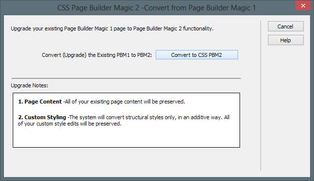
It's pretty simple and self-explanatory. To convert your page, click the Convert to CSS PBM2 button. To abort and leave your page as it is, click the Cancel button.
What happens to your existing page content?
Existing page content is completely preserved with no visual modification of any kind.
Will the conversion make my page look like a PBM 2 page?
No. In a conventional desktop or laptop browser, your page will look like it did before the conversion. The conversion process is adding the responsive and mobile-ready aspects of PBM 2—not the design aesthetic.
What happens to my existing CSS styles and files?
Your original CSS will neither be removed nor changed in any way.
So what is actually converted?
The converter may seem simple, but the processes it executes are quite complicated. It introduces an additional style sheet, named p7csspbm1_responsive.css, which is created in your p7csspbm folder and linked to your page. The command then examines each main-content, sidebar, and sidebar2 DIV on your page for proper assignment of the PVII Equal Height Columns classes. Upon completion of that task, the command will ensure that your page is linked to the PVII Equal Height Columns script and will create the script folder (p7ehc) if necessary. The original p7mobile script, which is no longer needed, will be removed. The command will then check for a proper Viewport Meta tag and create one if needed.
That's the process.
Upload your new files and folders
After conversion, upload your page(s) and the following files:
- p7csspbm/p7csspbm1_responsive.css
- p7ehc/p7EHCscripts.js
That's it. In most cases, your work is done. In some cases, you may need to do a bit of tweaking to address elements added to your page after it was originally created.
Notes and tips
The key to responsive design is to clear or reset all fixed width assignments in the CSS media query for phones. If you're a responsive newbie, you would be well advised (as we are doing now) to simply not assign fixed widths to any elements you add to your page.
What about images?
The conversion style sheet will take care of that for you.
What about videos or maps?
Your Page Builder user guide has instructions that will help you to make videos and maps responsive.
What about DIVs, forms, and tables?
Leave them width-less or if you have an awful good reason, assign a percentage width.