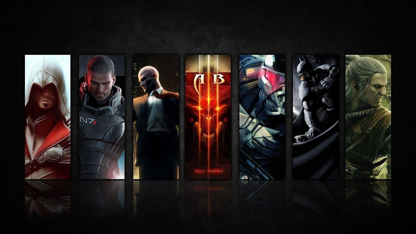
When you need to deploy an image gallery in a responsive page you're going to want a powerful and responsive gallery. Image Gallery Magic 2 is all that and more.
Your Adaptation layout will respond to the width of your browser window, adjusting the number, position, and width of columns, as well as the size of text, to ensure that your page always displays in a usable and readable way—in all browsers and on all devices. This is done seamlessly, with CSS, so that one page fits all devices and all screen sizes. Whether you are a CSS novice or a seasoned pro, CSS Adaptations is a valuable addition to your developer toolkit—instantly providing you with a means to deliver stable responsive designs to your customers and visitors.