Responsive Conversion Format OptionsPVII is the leader in creative extensions for Dreamweaver
Choose between Accordion and Jump List menu formats for phones and narrow devices.
Pop Menu Magic 3 Home | PMM3 Examples
Responsive Conversion Formats
When you create a PMM3 menu, you have 3 choices for how your menu behaves in terms of responsiveness:
No Conversion
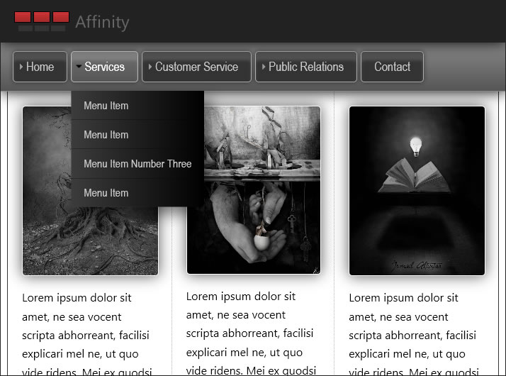
Use this option if your page is not a responsive design. If you need a responsive template, please see PVII CSS Templates. Your menu will appear in all devices the same way—as either a horizontal drop-down and flyout menu, or a vertical flyout menu.
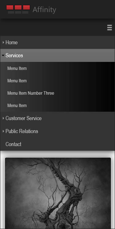
Vertical Accordion
Select this option if you would like your menu to convert to a Vertical Accordion on phones, small tablets (in portrait view), and in browser windows under 700 pixels wide.
Jump List (new with version 3.4.1)
Select this option if you would like your menu to convert to a Jump List (aka: Select List) on phones, small tablets (in portrait view), and in browser windows under 700 pixels wide. The following screen capture depicts a Jump List on an iPhone. Android devices will display the menu items left aligned and with hierarchical indents.
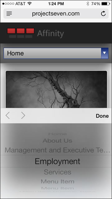
iPhone Tip: iPhone suppresses the spaces we use to ident sub-menu items. They also automatically center all items, rendering the issue of indents academic. If you need some kind of hierarchical indicator, the PMM3 script includes a variable that you can use to change from the default space chararcter to an actual character, which will be rendered. In the script file, go to line 20:
// indent char for Jump List
var p7PM3indent='\u2007';
For a regular dash, change the var to:
var p7PM3indent='-';
For an em dash, change the var to:
var p7PM3indent='\u2014';