The Navigation Bar tool is a first for us, and we do hope you enjoy it. As opposed to our dedicated Menu Building Tools, such as Adaptive Menu Magic and Maxi Menu Magic, the navigation bar is a single-level. While this may sound like a disadvantage, it is actually quite advantageous when all you need is a single level. Why? Because the CSS is quite a bit less complicated and the script quite a bit smaller. The main features of the Navigation bar are:
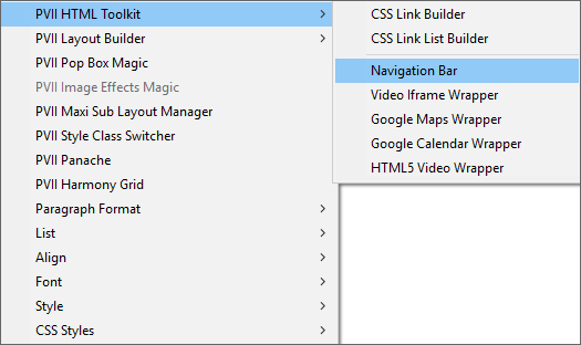
Right-click on your page where you want the Navigation Bar to appear and choose PVII HTML Toolkit > Navigation Bar...
The UI will open
Make a Horizontal Bar
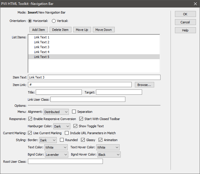
Choose Horizontal Orientation
Add a few links. For now, leave the Item Link set to #. When you are ready to finalize a menu, use the Browse button to set your links to actual pages. You can also assign a Title, a Target, and a User Class for each link.
Choose a Menu Alignment. Distributed will evenly distribute your links across the entire length of your navigation bar. It's one of the benefits only available because our menu uses the CSS Flexbox specification.
The Separation option sets a small amount of white space between menu items. Like this:
Enable Responsive Conversion linearizes (stacks) your menu items in small devices. It also creates a hamburger icon with which the menu can be shown or hidden.
You can also set the Hamburger icon color to Light or Dark, along with optional Toggle Text that says "Show Menu" alongside the Hamburger. If your site is not for English speakers, you can edit the Toggle Text at lines 511 and 512 of the p7TKNAV-01.css file.
Current Marking is on by default and there is usually no reason to change that. This ensures that the current page link in the menu is highlighted (bold). Designers of database-driven sites can optionally enable URL parameters to be included in the match.
Styling options include Border, which can be set to Light, Dark, or None. We put a lot of thought into the interface, so if you select a Border, it will be appropriately assigned based on the orientation of the menu and whether or not spacing is selected. Spaced menu items, for example, will have full borders around each item, while non-spaced menus will have single divider lines between each item.
You can also select Rounded corners, Glassy, and Animation effects.
Select link and hover Text Color and link and hover Background (Bgnd) Color. The color palette is the same one used for our other menu building and page building tools.
Advanced CSS authors can also assign a User Class to the menu.
Click OK and voila!
The Navigation Bar tool does vertical menus with equal aplomb!
I'll bet you're wondering how we managed to get the main menu at the top of this page to stick to the top when the page is scrolled. Here's a look at the UI settings for that menu...
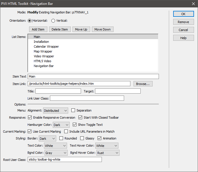
Note that there are two classes listed in the Root User Class box:
The sticky class fixes the menu at the top of the page, so it's always accessible. The toolbar-bg-white (or toolbar-bg-black) class sets a background color and a shadow on the toolbar, making it easy to see as you scroll the page.
The classes are included in the menu style sheet, so all you need to do is enter one or both in the User Class box.
Note: If you choose to use the sticky class, it will work best for menus that are at or near the top of your page. If you are using a Harmony page layout, place the menu above or between Harmony instances.