Affinity Boardroom Style GuideFrom PVII: the leader in responsive Dreamweaver tools
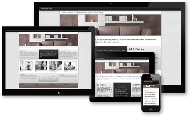
The Boardroom Theme
Get the power of an open source CSS framework with a fraction of the code and complexity, more stability, and legendary PVII technical support that is always free.
Boardroom uses a single CSS file for all 5 layouts: p7affinity-3.css. We'll list and discuss each rule. Note that simple declarations, such as background-colors and margins, for example, will not be covered. It is assumed that their meaning and purpose are obvious even to CSS beginners.
body
background-color: #ECECEC;
background-image: url(img/boardroom-bg.png);
font-family: "Droid Sans", Optima, "Segoe UI", Arial, sans-serif;
margin: 0px 0px 30px 0px;
The font-stack leads off with Droid Sans, which is a Google font. It is served via this link in the head of your Boardroom page:
<link href="http://fonts.googleapis.com/css?family=Droid+Sans" rel="stylesheet" type="text/css">
.p7DMM03
font-family: Cuprum, Optima, Arial, Helvetica, sans-serif;
font-size: 1.2em;
This rule serves an exception to the root Drop Menu Magic element to set a font size and family specific to the Boardroom page. The font set is Cuprum, which is a Google font served via this link in the head of your page:
<link href="http://fonts.googleapis.com/css?family=Cuprum" rel="stylesheet" type="text/css">
.p7DMM03.p7DMM.p7dmm-left
padding-left; 20px;
When your DMM menu is aligned left, we want to add a bit of breathing room..p7DMM03.p7DMM.p7dmm-right
padding-right; 20px;
When your DMM menu is aligned right, we do a bit of breathing room on the right.
img
vertical-align: bottom;
This is a baseline adjustment for images that is needed when a strict or HTML5 DOCTYPE is used. It prevents the inclusion of white space below the image.
#logo
padding: 10px 20px;
position: relative;
z-index: 10;
background-image: linear-gradient(#333, #111);
background-color: #151515;
box-shadow: 0px 0px 30px #000;
The logo is given some breathing room with padding. It is positioned relative, with a z-index, to cause its box-shadow to appear above the DIV below it. Background-image is a CSS linear gradient that begins with color #333 (dark gray) and ramps to near-black (#111). In the absence of a direction value, linear gradients render from top to bottom. We also set a box-shadow.
#banner
border-top: 1px solid #000;
border-bottom: 1px solid #000;
The banner element contains the banner image. We simply assign a border above and below.
img.scalable
height: auto !important;
width: auto !important;
max-width: 100%;
vertical-align: bottom;
Utility class for images. The scalable class makes images scale with window size. You must assign this class to any image you wish to make scalable.
.fancy
border: 1px solid rgba(255,255,255,.5);
box-shadow: 0px 0px 20px rgba(0,0,0,.5);
Add the fancy class to the scalable class to an image or to an image you have already made scalable to add a border and drop shadow effect that makes your image appear rasised (for details on rgba colors, see the RGBA section at the end of this page):
<img class="fancy"...> or <img class="scalable fancy"...>
.accented
border-radius: 5px;
border: 1px solid #222;
Add the accented class to an image as a single class or as an additional class to add rounded corners and a border:
<img class="accented"...> or <img class="scalable accented"...>
#layout
max-width: 1360px;
margin: 0px auto;
background-color: #FFF;
box-shadow: 0px 0px 20px rgba(0,0,0,.5);
border-radius: 0px 0px 7px 7px;
The main container for your Boardroom layout. We use a max-width and recommend that you do not change to a fixed width. You can change the max-width value, but if you do, you need to make a like adjustment to the max-width in your second media query (at the bottom of the CSS file):
@media only screen and (min-width: 700px) and (max-width: 1380px)
The max-width in the media query should be 20px higher than the max-width set in the #layout rule.
Affinity Boardroom Row and Column Structures
The following rules define the row and column structures in your page. The PVII approach to flexible CSS design has been carefully and fully researched to ensure optimum efficiency. If you've ever used a CSS grid framework, or Dreamweaver's Fluid Grid feature, you will probably be wondering where the extra few thousand lines of CSS code went. They are simply not needed.
.affinity-row
padding: 0px;
The default Boardroom row. All column structures are contained within an affinity-row DIV. This rule is actually a placeholder and, under normal circumstances, should probably not be edited.
.affinity-row:nth-child(even)
background-color: #EEE;
background-image: linear-gradient(#EEE, #CCC);
This rule assigns a gray gradient background to every other row. If you do not want this alternating row effect, delete or comment out the rule.
.affinity-row .affinity-row:nth-child(even)
background-color: transparent;
background-image: none;
background-image: none;
This rule turns off the alternating row effect for nested rows.
.affinity-row:after
visibility: hidden;
display: block;
content: "\0020";
clear: both;
height: 0;
This rule ensures that the floated elements inside each Affinity Row are cleared without having to add markup to your page.
.affinity-row .column-half
width: 50%;
float: left;
The structural wrapper for the columns in a 2-column row.
.affinity-row .column-third
width: 33.3333333%;
float: left;
The structural wrapper for the columns in a 3-column row.
.affinity-row .column-fourth
width: 25%;
float: left;
The structural wrapper for the columns in a 4-column row.
.affinity-row .column-fifth
width: 20%;
float: left;
The structural wrapper for the columns in a 5-column row.
.affinity-row.sidebar-left .column-1
width: 76%;
float: right;
The structural wrapper for the main content column in a 2-column row with a left sidebar.
.affinity-row.sidebar-left .column-2
width: 24%;
float: right;
The structural wrapper for the sidebar column in a 2-column row with a left sidebar. Both columns are floated right. This allows us to have the main column appear on the right side of your page even though it comes first in the source code. Note that the widths of the 2 columns add up to 100%. Feel free to edit the widths, but make sure the total equals 100%.
.affinity-row.sidebar-left .column-content
line-height: 1.5;
This rule targets the content inside both columns of a sidebar-left row. We simply set line-height. If you are an advanced CSS author, you can make this rule more global. For the convenience of beginners, we chose to make it a bit more specific in its targeting.
.affinity-row.sidebar-left .column-2 .column-content
font-size: .9em;
We reduce the font size by 10% for column-2 in the sidebar-left structure, which is the sidebar column.
.affinity-row.sidebar-right .column-1
width: 76%;
float: left;
The structural wrapper for the main content column in a 2-column row with a right sidebar.
.affinity-row.sidebar-right .column-2
width: 24%;
float: left;
The structural wrapper for the sidebar column in a 2-column row with a right sidebar. Both columns are floated left. The sidebar column displays on the right side of the page and its markup comes before the main content column's.
.affinity-row.sidebar-right .column-content
line-height: 1.5;
This rule targets the content inside both columns of a sidebar-right row. We simply set line-height.
.affinity-row.sidebar-right .column-2 .column-content
font-size: .9em;
We reduce the font size by 10% for column-2 in the sidebar-right structure, which is the sidebar column.
.left-border
border-left: 1px solid #000;
This class is assigned to the main content column, for example, when that column is displayed on the right side of the page. You can use this class on any element to which you want to assign a solid left border.
.right-border
border-right: 1px solid #000;
This class is assigned to the main content column, for example, when that column is displayed on the left side of the page. You can use this class on any element to which you want to assign a solid right border.
.left-right-border
border-left: 1px solid #000;
border-right: 1px solid #000;
This class is assigned, for example, to the middle column of a 3-column row.
Column Content and Padding Management
The following rules serve to manage the padding and line-heights inside of the content areas.
.column-content
line-height: 1.35;
padding: 15px 24px;
Line-height and padding inside of the default content areas.
.affinity-row.sidebar-right .column-content,
.affinity-row.sidebar-left .column-content,
.affinity-row.thirds.full-height .column-content
padding: 30px;
This rule increases the padding in sidebar layouts and in the 3-column full-height layout.
Padding Management for Nested Rows
The suite of Snippets that comes with Boardroom allows you to add rows to your page. Those rows can be added as either adjacent or nested rows (we'll cover that at the end of this document). Based on the placement of a row, you will need different types of padding attributes. These rules address that need.
.no-pad-left-top-bottom
padding-top: 0px !important;
padding-bottom: 0px !important;
padding-left: 0px !important;
Just as the rule name suggests, this class sets top, bottom, and left padding to zero. It does so with !important notations to ensure that this class always takes precedence. This class would be used, for example, on the first column in a nested row.
.no-pad-right-top-bottom
padding-top: 0px !important;
padding-right: 0px !important;
padding-bottom: 0px !important;
This class sets top, right, and bottom padding to zero. This class would be used, for example, on the last column in a nested row.
.no-pad-top-bottom
padding-top: 0px !important;
padding-bottom: 0px !important;
This class would be used on all columns in a nested row—except for the first and last. It would also be used on the column inside a single-column row.
Heading Styles
The following rules serve to style heading elements.
h1, h2, h3, h4
font-family: Cuprum, Optima, Arial, Helvetica, sans-serif;
line-height: normal;
margin: 30px 0px 0px 0px;
.column-content h1:first-child,
.column-content h2:first-child,
.column-content h3:first-child,
.column-content h4:first-child
margin-top: 10px;
This rule sets a 10px top margin for any heading that is the first element inside a content DIV. Subsequent headings in your content areas will revert to default margins.
.inner-row-heading
position: relative;
top: 20px;
margin: 0px 0px 0px 24px;
Use this class when you add a heading inside a row that contains multiple columns and the heading tag is positioned ablve the columns.:
<div class="affinity-row">

      <h2 class="inner-row-heading">Heading for the 2-column structure below</h2>

      <div class="column-half">

      <div class="column-content">

      <p>Affinity 2-Column Row: Column 1</p>

      </div>

      </div>

      <div class="column-half">

      <div class="column-content">

      <p>Affinity 2-Column Row: Column 2</p>

      </div>

      </div>

    </div>
Footer and Copyright Sections
The following rules define the footer area.
.footer
color: #000;
font-size: 0.8em;
border-radius: 0px 0px 5px 5px;
border-top: 1px solid;
border-color: #726561;
background-color: #857671 !important;
background-image: linear-gradient(#857671, #5F5450) !important;
The background properties are given !important notations to override the default alternate row background effect.
.footer h3, .footer h4
font-family: "Droid Sans", Optima, "Segoe UI", Arial, sans-serif;
font-weight: normal;
text-transform: uppercase;
margin: 10px 0px 0px 0px;
The font family for headings in the footer is reset from the default Cuprum to Droid Sans. The thicker lines of Cuprum do not display as clearly at small sizes as Droid Sans does.
.footer ul
margin: 0px;
padding: 0px;
margin-top: 10px;
The links in the footer are contained inside unordered lists.
.footer ul li
list-style-type: none;
line-height: 1.75;
.footer a
color: #000;
The footer links color.
.footer a:hover, .footer a:focus
color: #CFC9C7;
.copyright
font-size: 0.85em;
text-transform: uppercase;
clear: both;
padding: 5px 10px 15px 20px;
The copyright element is a paragraph at the bottom of the footer.
Utility and Accent Styles
The following rules define extra features and effects that can be used for design emphasis.
.column-content.largesse, .largesse
font-size: 1.25em;
line-height: 1.75em;
font-family: Cuprum, Optima, Arial, Helvetica, sans-serif;
Assign the largesse class to any element on your page to make its content stand out.
.affinity-row .blast
font-family: Cuprum, Optima, Arial, Helvetica, sans-serif;
font-size: 1.25em;
line-height: 1.75;
color: #BBB;
border-radius: 0px 0px 10px 10px;
padding: 28px 36px;
background: linear-gradient(#333, #111);
background-color: #333;
margin-bottom: 20px;
Use this class to assign a black accent box around your content.
.affinity-row .blast.gray
background: linear-gradient(#EEE, #AAA);
background-color: #DDD;
color: #000;
Add the gray class to the blast class to make your accent box gray:
<div class="column-content blast gray">
.affinity-row.sidebar-left .column-content .blast,
.affinity-row.sidebar-right .column-content .blast,
.full-round
border-radius: 6px !important;
Use this class on any element to give that element rounded corners on all 4 sides.
Smartphone Menu Media Query
The following Media Query targets smartphones and narrow windows. Please limit yourself to color changes only—unless your CSS skills are fairly advanced.
@media only screen and (min-width: 0px) and (max-width: 700px)
body
margin: 0px;
#layout
max-width: none;
padding: 0px;
.column, .column-1, .column-2, .column-3,
.column-half, .column-third, .column-fourth,
.column-fifth
float: none !important;
width: auto !important;
For smartphones we un-float all columns and reset their width to auto.
.column-content
height: auto !important;
max-height: 888678px;
border: none !important;
This rule is necessary to turn off the effects of the PVII Equal Height Columns script (in applicable layouts). When the script encounters the above height and max-height values, it excludes that column from its height calculations.
Media Query for Conventional Browsers at less than Max-Width
The following Media Query targets desktop and laptop browsers when the window width is less than the default max-width setting in the #layout rule. Remember—if you change the max-width on your #layout rule in the main section of your style sheet, you must change the max-width on this media query.
@media only screen and (min-width: 700px) and (max-width: 1380px)
#layout
max-width: none;
When browser window width hits the max-width set in the query (in this case 1380px) the layout becomes flexible.
This document will evolve to include additional information. If there is anything you are unsure about please do not hesitate to ask for support. PVII Support Home...
Editing and determining RGBA colors
The following procedures will enable you to convert HEX colors to RGBA in Dreamweaver CS5 and under. Dreamweaver CS5.5 and up have native support for RGBA built in.
RGBA stands for Red-Green-Blue-Alpha. Each value is separated by a comma. The alpha value allows you to set a transparency level for the element being colored—be it a background color, a text color, or a border color. White (255, 255, 255) and black (0, 0, 0) are easy. Dreamweaver can help you to determine the RGB values using its standard color picker tool.
In your CSS Styles panel, select the rule you want to edit. Start by assigning a Hex color. Let's say #6C6. Open the color picker. Then click the System Color Picker icon:
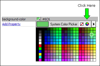
The System Color Picker will open:
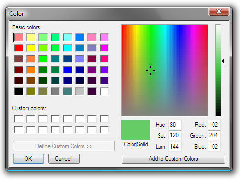
Your RGB numbers are listed as the Red, Green, Blue values: 102, 204, 102. So change your color value to:
rgba(102,204,102,1);
Remember, the "1" at the end is the alpha value and means your color is fully opaque (no transparency). To set transparency, choose a decimal value between 1 and 0. For example, to set 50% transparency, your values would be:
rgba(102,204,102,.5);
Using the Boardroom Snippets
Boardroom includes a suite of Snippets to help you add nested and adjacent rows to your page. To access the Snippets open the Snippets panel in Dreamweaver (Window > Snippets). Note that our Snippets panel below is depicted in a custom Workspace combined on a single panel along with Files, CSS Styles, and Tag Inspector. Your panel will likely be all by itself.
Inside the panel, locate and expand the PVII folder and you will see the Boardroom Snippets.
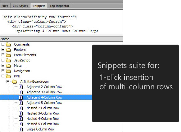
There are Snippets for Adjacent and Nested rows.
To insert a Nested Row
Use a nested row Snippet when you want to add a row inside of an existing row. If, for example, you would like to place a row between paragraphs, place your cursor at the end of the paragraph that you want the row to follow. Then switch to code view:
<p>This is s paragraph. I want my new row to come right after this text.</p>

      <p>This is the next paragraph. My new row will be between these 2 paragraphs.</p>
In Code View, place your cursor just to the right of the first paragraph's closing tag </p> and press Enter once to create a new line.
<p>This is s paragraph. I want my new row to come right after this text.</p>


<p>This is the next paragraph. My new row will be between these 2 paragraphs.</p>
Place your cursor on the blank line, between the 2 paragraphs, and double-click your desired Nested Snippet (Snippets can also be dragged to their destination).
That's it. Switch back to Design View and add content to your new row.
To insert an Adjacent Row
Use an adjacent row Snippet when you want to add a row above or below an existing row. If, for example, you would like to place a row above the first row inside the content area of Layout 01, place your cursor inside that row and then switch to code view:
<div class="affinity-row">

<div class="column-content largesse">

<p>Affinity Boardroom extends the scope of your Affinity layout choices to include designs suitable for a corporation or professional firm that wants to present a serious image without sacrificing design. Like all Affinity designs, Boardroom is mobile-ready and responsive.</p>

</div>

</div>
Place your cursor just to the left of the affinity-row DIV and press Enter to create a new line:
[New Line]

      <div class="affinity-row">

<div class="column-content largesse">

<p>Affinity Boardroom extends the scope of your Affinity layout choices to include designs suitable for a corporation or professional firm that wants to present a serious image without sacrificing design. Like all Affinity designs, Boardroom is mobile-ready and responsive.</p>

</div>

</div>
Place your cursor on the new line and double-click your desired Adjacent Snippet (Snippets can also be dragged to their destination).
That's it!