Buy Now ($95) | Synergy Home | Synergy User Guide | DMM User Guide
Drop Menu Magic Style GuideFrom PVII: the leader in responsive Dreamweaver tools
Drop Menu Magic is one of the only automatically responsive menu systems for Dreamweaver. Of curse, we make the other ones, too.
The DMM Style Guide
For this guide we are going to examine the DMM CSS file for the Affinity Page Pack theme: p7DMM01.css
.p7DMM01
position: relative;
background-color: #7BA4C1;
border-bottom: 1px solid #FFF;
box-shadow: 0px 0px 30px rgba(0,0,0,.45);
This is the root DMM container. We use a container to make it easy for you to align the menu. Without the container, you would need to write your own custom CSS rules (and probably markup) to be able to center or right-align your menu. The bottom border and shadow serve to create a subtle bevel effect.
.p7DMM01:after (do not edit)
content: "\0020";
clear: both;
font-size: 0px;
line-height: 0;
display: inline;
height: 0px;
This rule serves to clear the floated elements inside the menu.
.p7DMM01.p7dmm-centered (do not edit)
text-align: center;
.p7DMM01.p7dmm-right (do not edit)
text-align: right;
The above 2 classes are assigned to the menu by the DMM interface based on the alignment option you choose.
.p7DMM01 ul
margin: 0px;
padding: 0px;
display: inline-block;
vertical-align: bottom;
The menu UL element is displayed as an inline block, which permits the menu to be easily aligned using the text-align property on the .p7dmm-centered or .p7dmm-centered classes that the interface assigns when you choose an alignment option other than left. In HTML5, inline or inline-block elements sit above the text baseline so we use vertical-align bottom to remove unwanted whitespace below the menu.
.p7DMM01 ul li
list-style-type: none;
float: left;
padding: 10px 0px;
margin-right: 8px;
This rule defines the root LI elements.
.p7DMM01 ul li:last-child
margin-right: 0px;
This rule allows us to remove the right margin for the last LI element.
.p7DMM01 ul a
color: #000;
font-size: 1em;
padding: 10px 12px;
text-decoration: none;
border: 1px solid;
border-radius: 5px;
border-color: #517186;
display: block;
-webkit-transition: all linear .35s .1s;
transition: all linear .35s .1s;
-webkit-transition-property: background-color, box-shadow, border-color;
transition-property: background-color, box-shadow, border-color;
This rule defines the root level links. The links are transparent with a rounded 1px border. The transition property stages a linear CSS animation for all properties, with a duration of .35 seconds, and a delay of .1 seconds. Firefox and Explorer support the standard property name, while Safari and Chrome still require a vendor prefix—hence the double entry. We then set separate transition-property values (in standard and Webkit syntax) to limit the properties being animated. We don't, for instance, want padding changes triggered by media queries to be animated as that might be a bit distracting.
.p7DMM01 ul a:hover,
.p7DMM01 ul a:focus,
.p7DMM01 ul a.open,
.p7DMM01 ul a.current_mark.closed
outline: none;
border-color: #FFF;
border-color: rgba(255,255,255,0.65);
color: #FFFFFF;
box-shadow: inset 0px 12px 8px rgba(255,255,255,.2);
background-color: #487799;
The hover, focus, and open, and current-marked styles for the root menu items. Border and box-shadow colors are set in RGBA format. See discussion on RGBA at end of guide.
.p7dmm-sub-wrapper (do not edit)
position: absolute;
top: 100%;
width: 100%;
left: 0px;
display: none;
The container for the sub-menus.
.p7DMM01 ul ul (do not edit)
margin: 0px;
display: inline-block;
padding: 0px;
vertical-align: bottom;
The sub-menu UL element.
.p7DMM01 ul ul li
padding: 8px 0px;
The sub-menu LI elements
.p7DMM01 ul ul a
background-color: rgba(255,255,255,.5);
border-color: #FFF;
box-shadow: none;
font-size: 0.8em;
padding: 8px 10px;
box-shadow: inset 0px 0px 8px rgba(255,255,255,.15);
color: #000;
The sub-menu links. Background and box-shadow colors are set in RGBA format. See RGBA discussion at end of guide.
.p7DMM01 ul ul a:hover
background-color: rgba(255,255,255,0.6);
border-color: #EEE;
color: #000000;
box-shadow: inset 0px 12px 20px rgba(123,164,193,.2);
The sub-menu hover style.
.p7DMM01 ul ul a.current_mark
color: #447395;
The sub-menu current-marked style. Highlights links that match the address of your page.
.p7DMM-toolbar (do not edit)
display: none;
The toolbar contains the icon that allows smartphone users to hide and show the menu.
Vertical Menu Rules
The following rules apply only to menu's that are set to display in vertical accordion mode.
.p7DMM01.dmm-vertical ul a.trig (do not edit)
background-image: url(img/p7dmm_east_black.gif);
background-repeat: no-repeat;
background-position: left center;
Assigns a right-pointing arrow to the root links that have associated sub-menus.
.p7DMM01.dmm-vertical ul a.open.trig (do not edit)
background-image: url(img/p7dmm_south_black.gif);
background-repeat: no-repeat;
background-position: left center;
Assigns a down-pointing arrow to the root links whose sub-menus are open.
.p7DMM01.dmm-vertical
background-color: transparent;
box-shadow: none;
border-bottom: none;
The root menu container for menus that are set to vertical accordion mode.
.p7DMM01.dmm-vertical ul,
.p7DMM01.dmm-vertical ul ul (do not edit)
display: block;
padding: 0px;
margin: 0px;
The root and sub-menu UL elements in menus set to vertical accordion mode are set to display block, as opposed to the inline-block setting needed for horizontal mode.
.p7DMM01.dmm-vertical ul ul
border-radius: 0px 0px 5px 5px;
background-color: #DDD;
The sub-menu UL element in menus set to vertical accordion mode are set to show rounded corners on the bottom. Note that shorthand syntax for border radius describes the 4 corners of a box in clockwise order, starting from the top left.
.p7DMM01.dmm-vertical ul li,
.p7DMM01.dmm-vertical ul ul li (do not edit)
float: none;
display: block;
padding: 0px;
margin-right: 0px !important;
The root and sub-menu LI elements in menus set to vertical accordion mode are un-floated. While advanced CSS authors might want to edit this rule in some situations, we would advise you to leave it alone.
.p7DMM01.dmm-vertical ul li
margin-bottom: 8px;
The root LI elements in menus set to vertical accordion mode are given a bottom margin to provide separation between links.
.p7DMM01.dmm-vertical ul li:last-child
margin-bottom: 0px;
The last root LI element has its bottom margin zeroed out.
.p7DMM01.dmm-vertical ul ul li
margin-bottom: 0px;
We zero out the bottom margin for all sub-menu LI elements.
.p7DMM01.dmm-vertical ul a
padding: 8px 18px;
Padding for the root menu links for menus in vertical accordion mode. 18px on the left is required to leave room for the arrows.
.p7DMM01.dmm-vertical ul a.open
border-radius: 5px 5px 0px 0px;
In vertical accordion mode menus, the rounded corners on the root links are set to zero on the bottom when the associated sub-menu is showing.
.p7DMM01.dmm-vertical ul ul a
border-top: none;
border-radius: 0px;
border-bottom: 1px solid;
border-left: 1px solid;
border-right: 1px solid;
border-color: rgba(255,255,255,.35);
background-color: transparent;
font-size: .9em;
The sub-menu link styles for menus set to vertical accordion mode.
.p7DMM01.dmm-vertical ul ul li:last-child a
border-radius: 0px 0px 4px 4px;
The last sub-menu link item is given rounded bottom corners to match the rounded bottom corners on the sub-menu UL element (.p7DMM01.dmm-vertical ul ul).
.p7DMM01.dmm-vertical ul ul a:hover
background-color: rgba(142,176,202,0.6);
color: #000000;
The sub-menu link hover styles.
.p7DMM01.dmm-vertical .p7dmm-sub-wrapper (do not edit)
width: 100%;
position: relative;
padding: 0px;
margin: 0px;
top: 0px;
The sub-menu wrapper for vertical accordion mode menus.
Exception rules for Vertical Drop Down Mode
The following rules take effect automatically if you set your menu Mode to Vertical Dro Down.
.p7DMM01.dmm01-pop .p7dmm-sub-wrapper (do not edit)
text-align: left;
padding-bottom: 30px;
padding-right: 30px;
width: auto;
left: auto;
display: none;
z-index: 99;
Do not edit this rule. This is the sub-menu container and must not be styled.
.p7DMM01.dmm01-pop ul ul
background-color: #222;
border-radius: 0px 0px 5px 5px;
border: 1px solid;
border-top: none;
border-color: #000000;
This styles the sub-menu drop-down box.
.p7DMM01.dmm01-pop ul ul li
padding: 0px;
float: none;
margin: 0px;
This rule turns off padding, float, and margin for the sub-menu list items. Turning off the float is what effectively turns the sub-menu from a horizontal to a vertical mode.
.p7DMM01.dmm01-pop ul ul a
background-color: transparent;
box-shadow: none;
border-radius: 0px;
font-size: 0.8em;
padding: 8px 20px;
box-shadow: none;
color: #B4B4B4;
border: none;
This rule styles the sub-menu links when the menu is in Vertical Drop Down mode.
.p7DMM01.dmm01-pop ul ul li:last-child a
border-radius: 0px 0px 4px 4px;
This rule turns on bottom border-radius (rounded corners) for the last link in the drop-down so that it matches up with the rounder bottom corners of the sub-menu box.
.p7DMM01.dmm01-pop ul ul a:hover
background-color: transparent;
color: #FFFFFF;
background-color: #444;
box-shadow: none;
This rule styles the hover state for links when the menu is in Vertical Drop Down mode.
.p7DMM01.dmm01-pop ul ul a.current_mark
color: #EEE;
font-weight: bold;
The current-marked sub-menu link for menus in Vertical Drop Down mode.
Smartphone Menu Media Query
The following Media Query targets smartphones and narrow windows. Please limit yourself to color changes only—unless your CSS skills are fairly advanced.
@media only screen and (min-width: 0px) and (max-width: 700px)
.p7DMM01.responsive (do not edit)
padding: 0px;
margin: 0px;
The root menu container.
.p7DMM01.responsive ul a.trig (do not edit)
background-image: url(img/p7dmm_east_black.gif);
background-repeat: no-repeat;
background-position: left center;
Right-pointing arrows set for root links that have associated sub-menus.
.p7DMM01.responsive ul a.open.trig (do not edit)
background-image: url(img/p7dmm_south_black.gif);
background-repeat: no-repeat;
background-position: left center;
Down-pointing arrows set for root links whose sub-menus are open.
.p7DMM01.responsive ul li (do not edit)
margin: 0px;
padding: 0px;
The root level LI elements.
.p7DMM01.responsive ul,
.p7DMM01.responsive ul ul (do not edit)
display: block;
padding: 0px;
margin: 0px;
The root level and sub-menu UL elements.
.p7DMM01.responsive ul li,
.p7DMM01.responsive ul ul li (do not edit)
float: none;
display: block;
margin: 0px;
padding: 0px;
The root level and sub-menu LI elements.
.p7DMM01.responsive ul li a,
.p7DMM01.dmm-vertical ul li a
border: none;
border-radius: 0px;
padding: 8px 18px;
border-bottom: 1px solid rgba(255,255,255,.15) !important;
The root and sub-menu links.
.p7DMM01.responsive ul li:last-child a
border-bottom: none;
The last link in the root level.
.p7DMM01.responsive .p7dmm-sub-wrapper (do not edit)
width: 100%;
position: relative;
padding: 0px;
margin: 0px;
top: 0px;
The sub-menu container.
.p7DMM01.responsive .p7DMM-toolbar,
.p7DMM01.dmm-vertical .p7DMM-toolbar
position: relative;
z-index: 999;
display: block;
background-color: #222;
text-align: right;
padding: 6px;
cursor: pointer;
The smartphone toolbar that allows users to toggle the menu open and closed.
.p7DMM01.dmm-vertical .p7DMM-toolbar
background-color: #222222 !important;
border-radius: 5px 5px 0px 0px;
The smartphone toolbar that allows users to toggle the menu open and closed. For menus that are set to vertical accordion mode only.
.p7DMM01.responsive ul.opened,
.p7DMM01.dmm-vertical ul.opened (do not edit)
display: block;
This class is programmatically assigned by the menu script to toggle the menu open.
.p7DMM01.responsive ul.closed,
.p7DMM01.dmm-vertical ul.closed (do not edit)
display: none;
This class is programmatically assigned by the menu script to toggle the menu closed.
.p7DMM01.responsive .p7DMM-toolbar img,
.p7DMM01.dmm-vertical .p7DMM-toolbar img
border: none;
padding-left: 16px;
Styling for the toolbar icon.
.p7DMM01.responsive .p7DMM-toolbar a:before,
.p7DMM01.dmm-vertical .p7DMM-toolbar a:before
content: "Hide Menu";
Here we use CSS to add text to the toolbar when the menu is showing. You can edit the content value if, for instance, your site is in a language other than English. Unless you your CSS skills are advance, you should limit your edits to simple text.
.p7DMM01.responsive .p7DMM-toolbar.closed a:before,
.p7DMM01.dmm-vertical .p7DMM-toolbar.closed a:before
content: "Show Menu";
Here we use CSS to add text to the toolbar when the menu is hidden.
.p7DMM01.responsive .p7DMM-toolbar a,
.p7DMM01.dmm-vertical .p7DMM-toolbar a
color: #999;
text-transform: uppercase;
font-size: .8em;
background-color: transparent !important;
border: none !important;
text-decoration: underline;
The link style for the hide/show toolbar.
.p7DMM01.responsive .p7DMM-toolbar:hover a,
.p7DMM01.dmm-vertical .p7DMM-toolbar:hover a
color: #EEE;
The toolbar link hover style.
.p7DMM01.responsive .p7DMM-toolbar.closed a,
.p7DMM01.dmm-vertical .p7DMM-toolbar.closed a
color: #EEE;
Exceptions to the toolbar link styles when the menu is closed.
.p7DMM01.responsive .p7DMM-toolbar img,
.p7DMM01.dmm-vertical .p7DMM-toolbar img
opacity: .5;
We fade the default toolbar icon, which is pure white, to temper its contrast against a dark background. This is in effect when the menu is open.
.p7DMM01.responsive .p7DMM-toolbar:hover img,
.p7DMM01.dmm-vertical .p7DMM-toolbar:hover img
opacity: .85;
When the toolbar is hovered over, we reduce the transparency. Note, that since hover is not available for touch devices, this rule really only affects conventional browsers when the window is quite narrow. In other words, most visitors to your site will never see this rule in action.
.p7DMM01.responsive .p7DMM-toolbar.closed img,
.p7DMM01.dmm-vertical .p7DMM-toolbar.closed img
opacity: 1;
We turn off transparency on the toolbar icon when the when is hidden.
.p7DMM01.responsive .p7DMM-toolbar.closed:hover,
.p7DMM01.dmm-vertical .p7DMM-toolbar.closed:hover
background-color: #466275;
We chanfe the background color of the toolbar when it is hovered over.
.p7DMM01.dmm-vertical *
border-radius: 0px !important;
We disable all rounded corners in vertical accordion mode menus when viewed on a smartphone.
.p7DMM01.dmm01-pop .p7dmm-sub-wrapper (do not edit)
padding-bottom: 0px;
padding-right: 0px;
width: 100%;
We remove the padding and set full width for the sub-menu wrapper when the menu is in Vertical Drop Down mode.
Media Query for Smartphones in Landscape orientation only
The following Media Query targets smartphones only—and only when they are being viewed in landscape mode.
@media only screen and (max-device-width: 480px) and (orientation : landscape)
.p7DMM01.responsive ul a
font-size: 1.35em;
padding: .35em .75em;
We increase text size and alter padding for root menu items to make the menu more readable in smartphones turned sideways.
.p7DMM01.responsive ul ul a
font-size: 1em;
padding: .3em 1em;
We increase text size and alter padding for sub-menu items to make the menu more readable in smartphones turned sideways.
This document will evolve to include additional information. If there is anything you are unsure about please do not hesitate to ask for support. PVII Support Home...
Editing and determining RGBA colors
The following procedures will enable you to convert HEX colors to RGBA in Dreamweaver CS5 and under. Dreamweaver CS5.5 and up have native support for RGBA built in.
RGBA stands for Red-Green-Blue-Alpha. Each value is separated by a comma. The alpha value allows you to set a transparency level for the element being colored—be it a background color, a text color, or a border color. White (255, 255, 255) and black (0, 0, 0) are easy. Dreamweaver can help you to determine the RGB values using its standard color picker tool.
In your CSS Styles panel, select the rule you want to edit. Start by assigning a Hex color. Let's say #6C6. Open the color picker. Then click the System Color Picker icon:
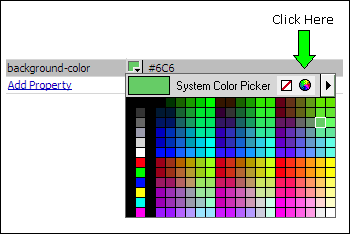
The System Color Picker will open:
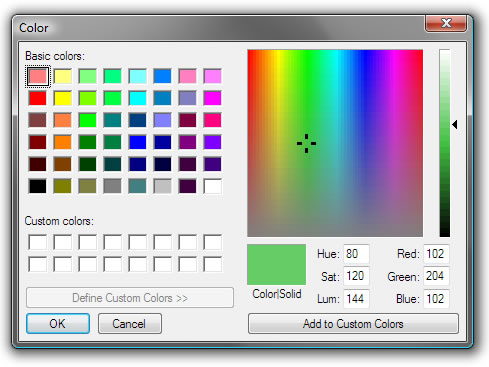
Your RGB numbers are listed as the Red, Green, Blue values: 102, 204, 102. So change your color value to:
rgba(102,204,102,1);
Remember, the "1" at the end is the alpha value and means your color is fully opaque (no transparency). To set transparency, choose a decimal value between 1 and 0. For example, to set 50% transparency, your values would be:
rgba(102,204,102,.5);